
WISER

WISER is my first UX/UI passion project - a minimalistic, straightforward learning app designed as an accessible, upgraded alternative to traditional tutoring.
My role
UX Research + Strategy, Wireframing, Prototyping, UI
Why I chose to design WISER as a first project:
Drawing from my experience as both an online tutor and a former student on an online platform, I brought a first-hand understanding to user research for WISER. In addition, years of interaction with Korean individuals and families abroad revealed a key challenge: maintaining Korea’s high academic standards through Western-based tutoring platforms. With fluency in Korean and insight into cultural expectations, I explored this issue further, conducting a competitive audit of major platforms like Preply and italki. By validating and cross-checking data, I identified major gaps and opportunities for differentiation. This synthesis of personal insight and competitive research informed a solution that benefits both parents and WISER’s business model, creating a mutually valuable ecosystem.
Focus Pain Point
Users (learners) do not have the opportunity to asess compatibility with a tutor's teaching style before booking, leading to wasted time and money. In return, tutors face reduced learner retention and inconsistent workflow.
Solution
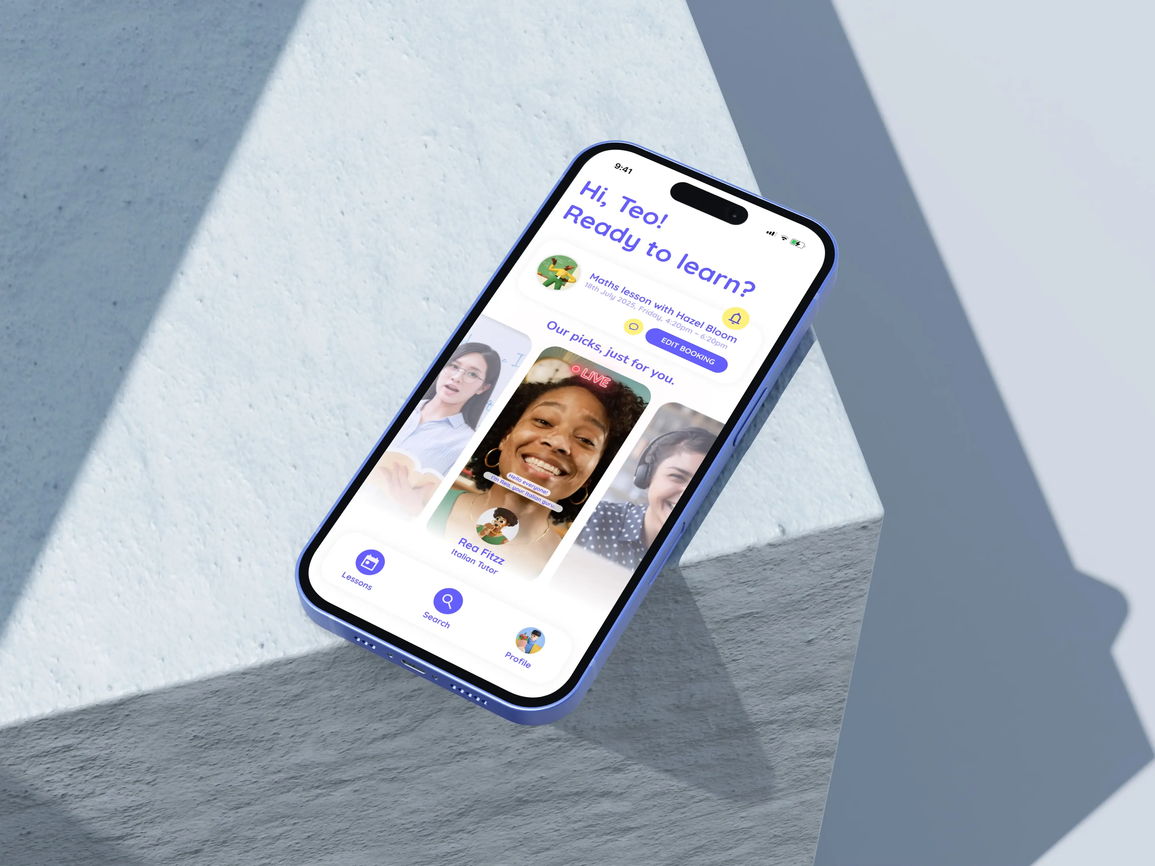
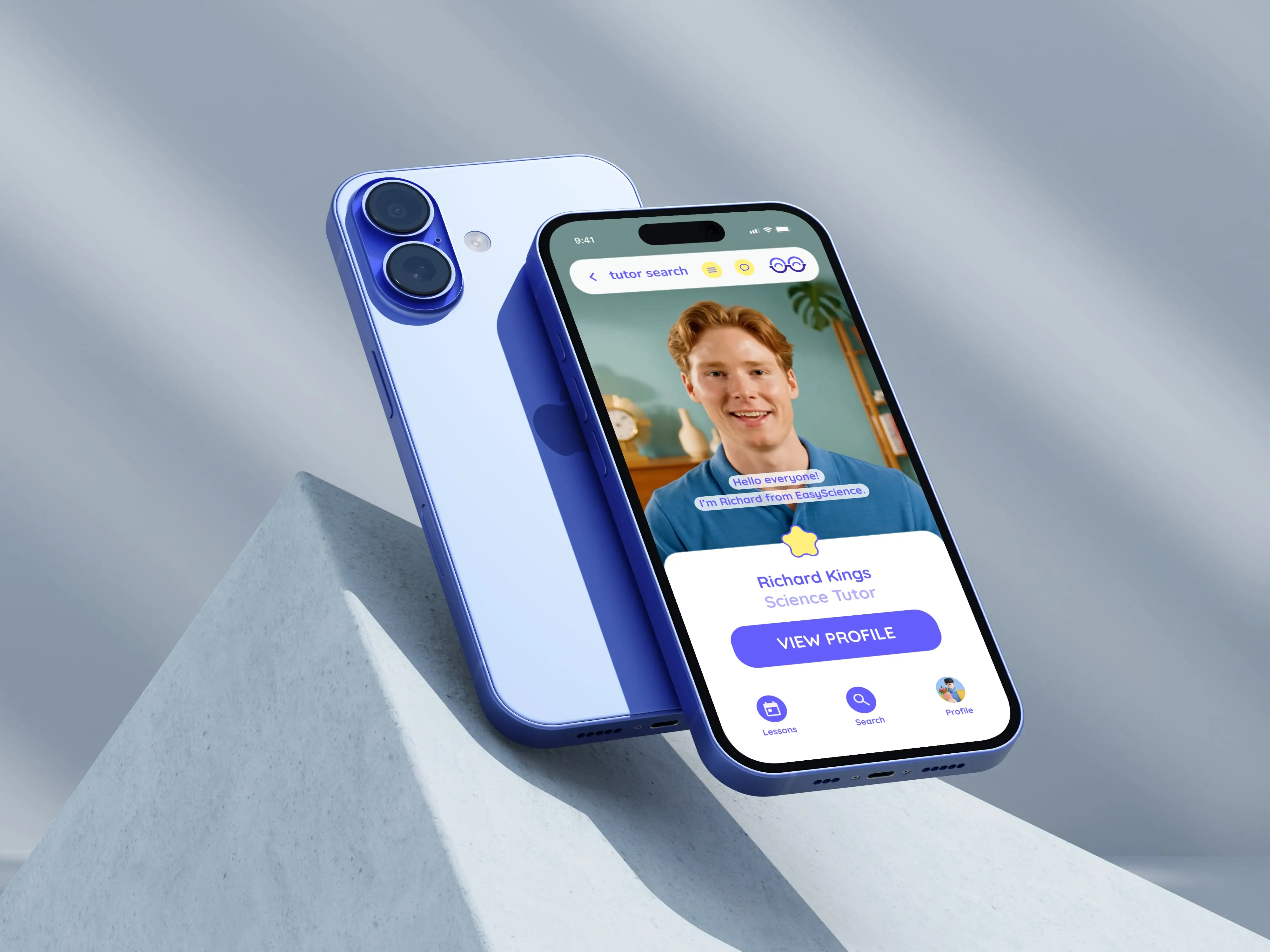
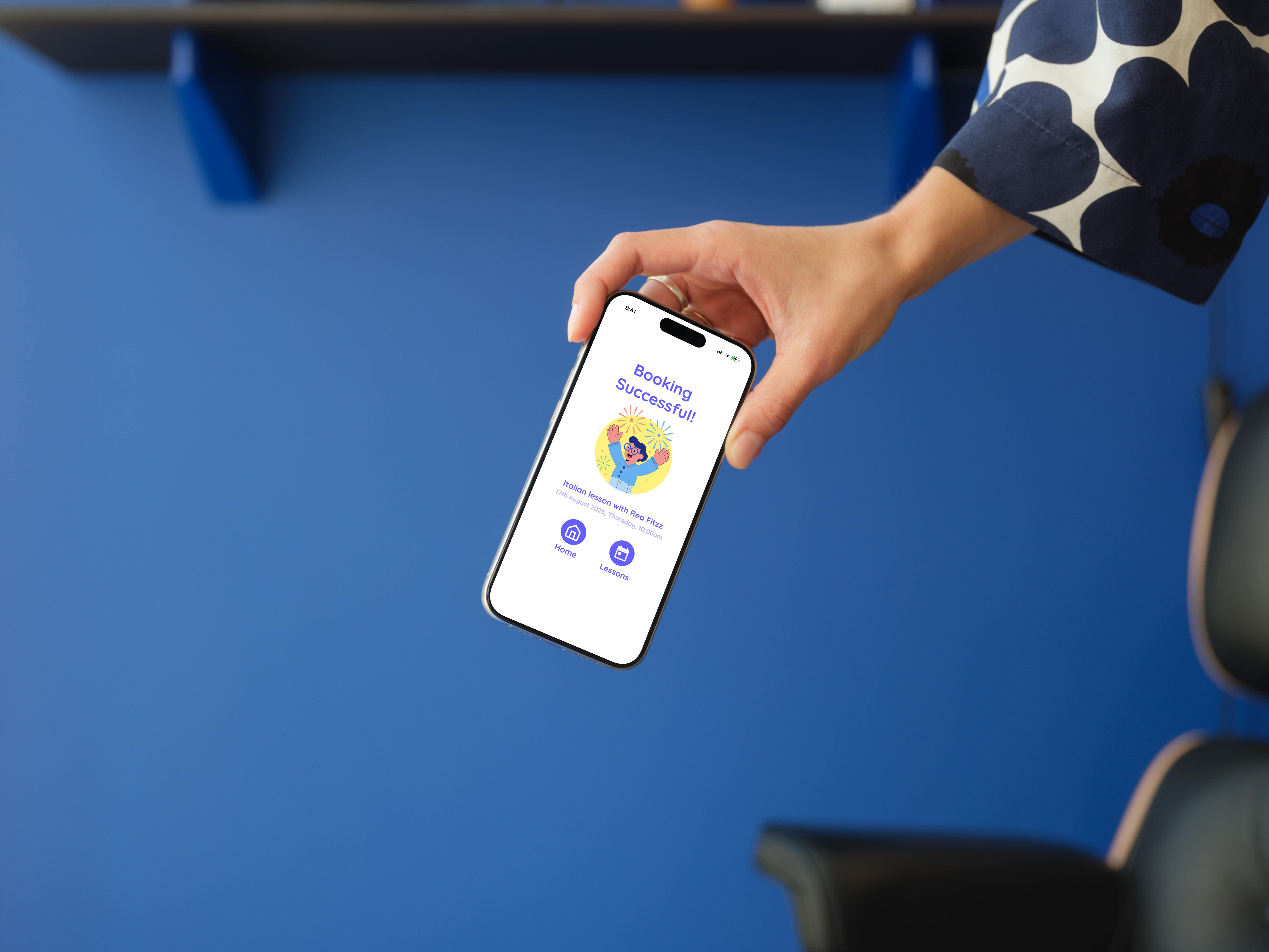
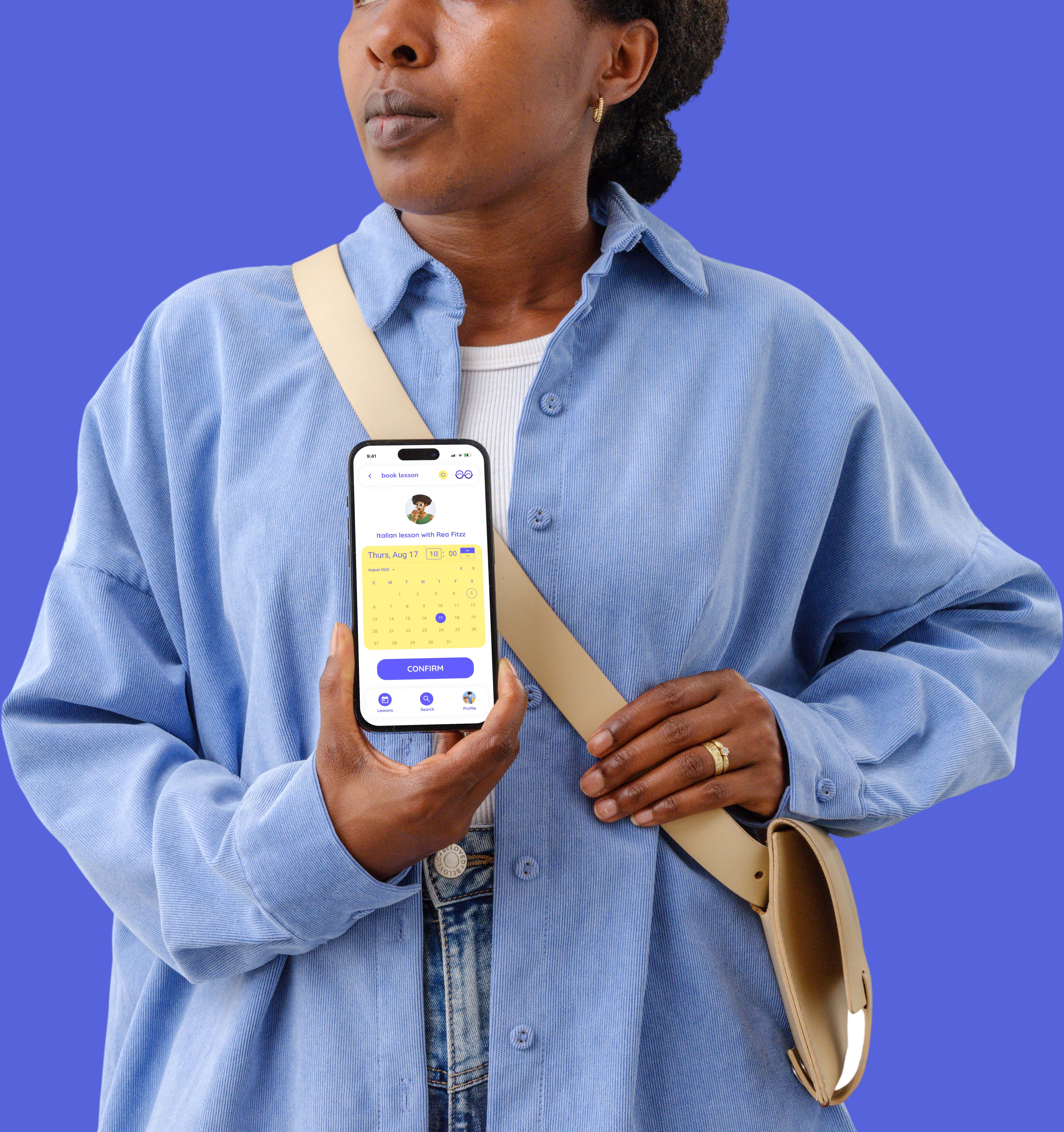
WISER introduces tutor livestreams and lesson snippets. Livestreams help users experience tutors' styles beforehand and receive tailored recommendations. Lesson snippets let tutors upload short clips (with user consent), allowing students to gauge compatibility before commitment.
Key Takeaways
This project reminded me how real design bias can be - such as assuming users will instinctively know what steps to take. I learned that good design also means simplifying even the most complex, information-heavy pages so that anyone can use them with ease. And that great design means considering every user, even in less likely scenarios. I have also learned that while aesthetics are important, accessibility and readability should always take priority, especially when working with UI elements like colour contrast. I had even found and used a website where I could check whether the contrast between the colours used for WISER met the web readability standards. I spent a lot of time reiterating before coming across the final version of the app. To my surprise, the final version ended up having all of the features I had in mind for WISER, but by using a lot less space on the screen.
Throughout the process, I learned to stay resilient and resourceful, constantly looking for ways to optimise my workflow. Especially nowadays, with new tools constantly on the rise. I learned that it's not about replacing, yet about leveraging to optimize - saving time and increasing productivity. For instance, to make my app look more realistic, I repurposed the accessible alt text from avatar icons in Figma into detailed prompts for Google Veo3, helping me generate original visuals for the lesson snippets on tutor profiles, livestream on t homepage, and tutor search.
Most importantly, I learned to experiment fearlessly with new tools and think from both a user and business perspective - understanding that good design is as much about empathy and adaptability as it is about visual polish.
N/A - Passion Project
App Design
1 Month
2025
Gallery
Gallery
Gallery
Gallery
Gallery


No items found.